THE PROBLEM
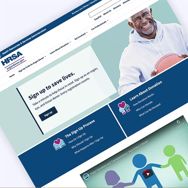
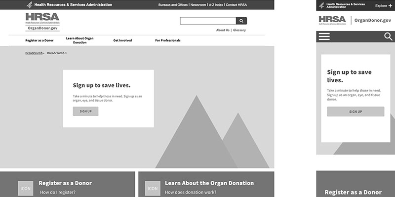
The Health Resources & Services Administration (HRSA), has been working to consolidate their government websites into one design system. Organdonor.gov needed to be translated from its current state as a stand-alone site to be integrated into the HRSA design system. I supported this project by guiding usability testing, conceptualizing new information architecture, site templates, and designs to support this work for organdonor.gov.
Our goal was to improve the usability of the site to increase the number of organ donors.
My Role: Lead UX Designer, Art Director, IA, UI
URL: organdonor.gov

THE AUDIENCE
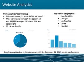
I began the discovery process by looking through analytics and conducting an online survey to better understand our what’s important to the site audiences.
Existing site users were interested in stats, stories and learning about how donation works. But the site’s most popular pages were not always leading site users to sign up as organ donors, the most critical conversion on the site.
After creating the information architecture, I managed a contractor who conducted three rounds of rapid iterative testing, including new IA ideas with each round. This helped me evolve IA thinking, create updated prototypes then quickly re-test those ideas with our target audiences.
THE IDEAS
Enhanced Sign Up and Stats Sections
Not all site users understood the sign up process. So I built out new pages under the “Sign Up” section to help answer questions, including, “Why Sign Up?” and “What Happens After I Sign Up.” Donor families will ultimately sign off on organ donation, so its important organ donors are communicating with their families about their wishes.
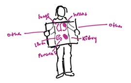
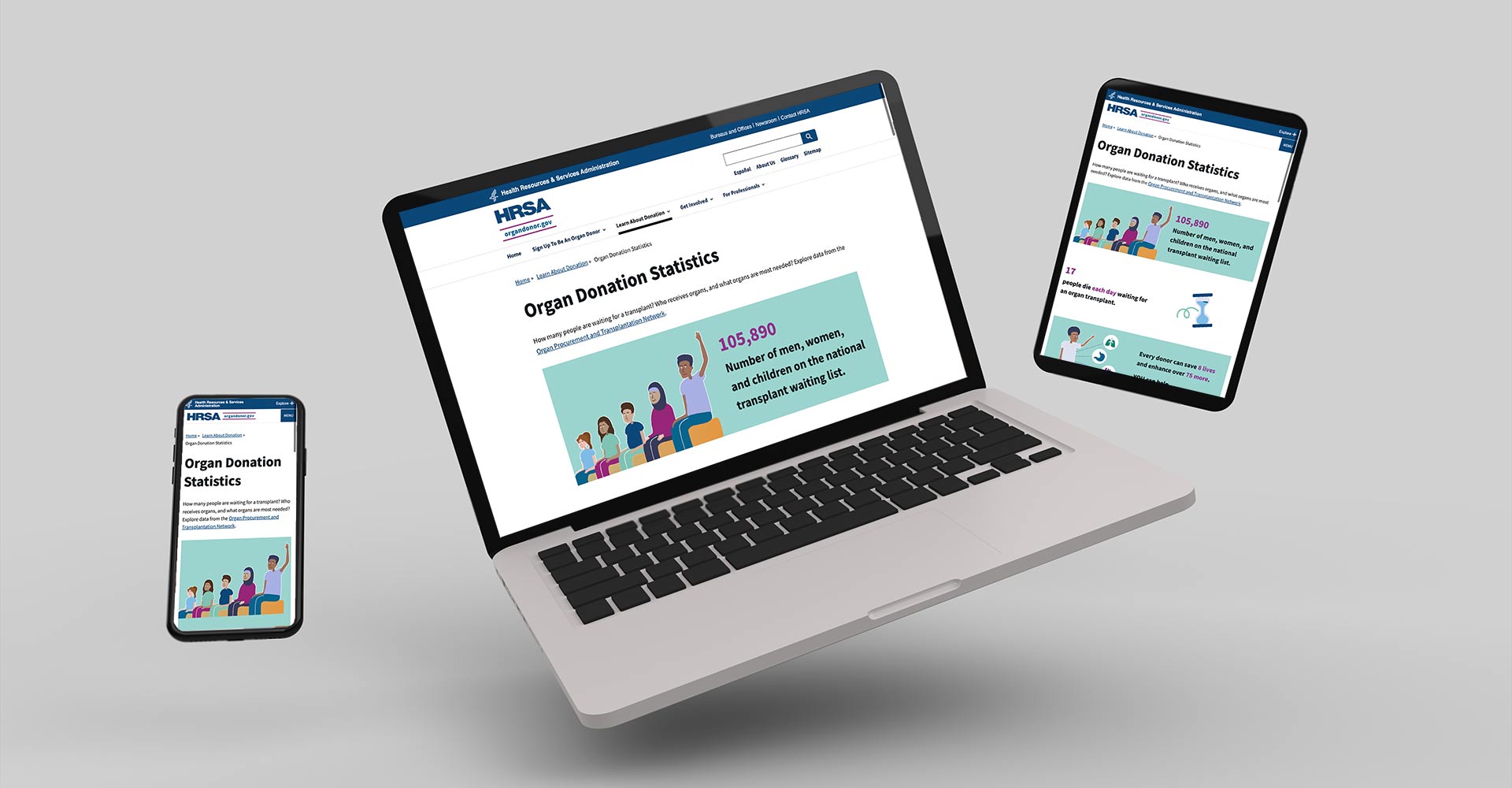
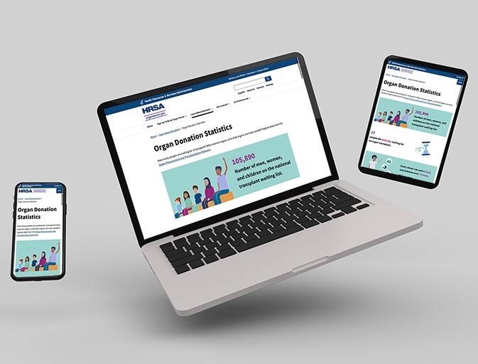
The most popular site page was the statistics page, so I conceptualized a flow of graphics and illustrations that would tell a story. These stats were intended to link deeper into specific content across the site, furthering the user journey. These graphics were repurposed on other pages.
Extending the Journey Through Visual Promotions
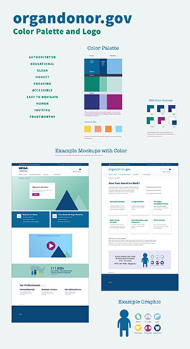
I sought to increase donor registration on the site by cross-promoting popular content through visual promotions:
- Visual promotions to encourage registration when users may be ready to sign up.
- Illustrated statistics with links to deeper information about donation.
- Photos and teasers to donor stories, especially for users learning about donation.
Prototype:
THE SOLUTION
The site was fully integrated and released on-time and on-budget. Because I talked to so many users through the rapid iterative testing, I have confidence that our IA is aligned with user expectations.
The biggest limitation was the lack of time to refine the nuances of what makes these designs successful. The developers were under a separate contract with the client, and their other responsibilities limited them from fully implementing our vision. Future work to refine and enhance this experience has been suggested.
