THE PROBLEM
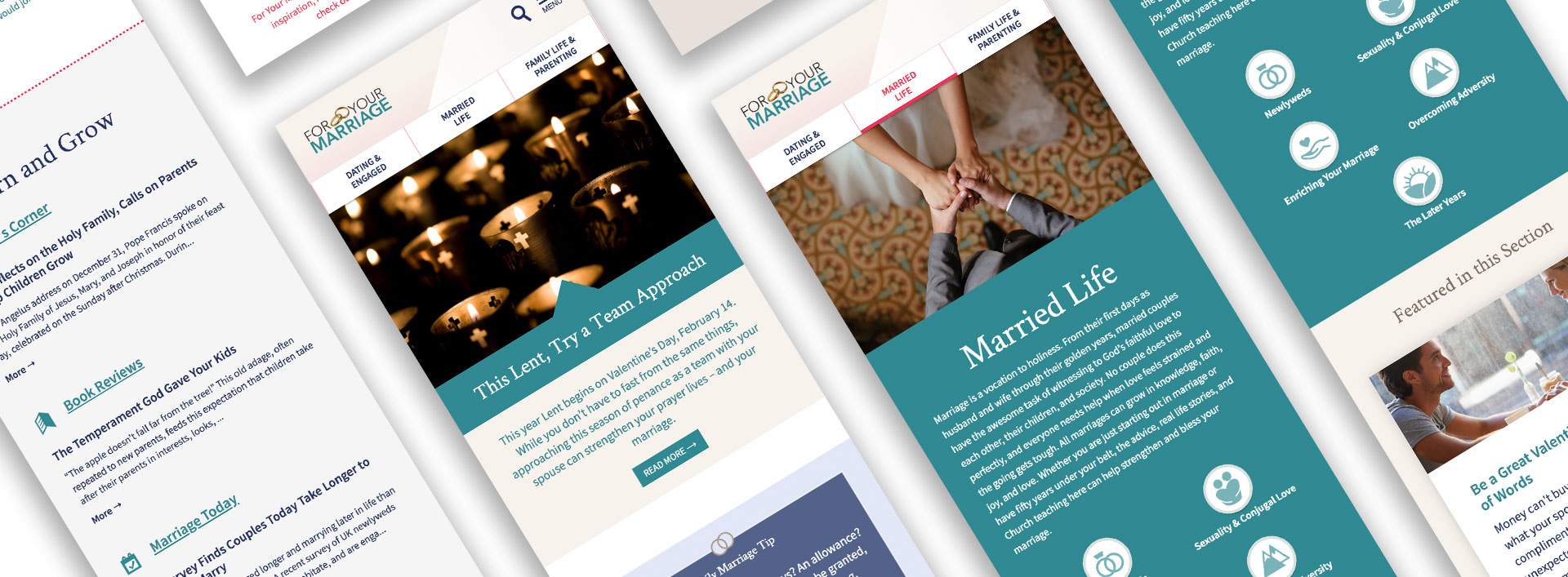
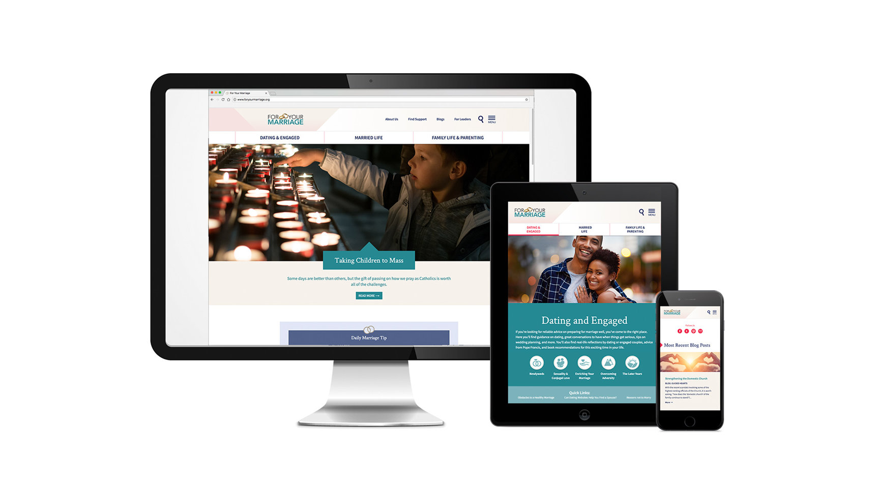
For Your Marriage website visitors were having trouble finding site articles and resources because of the lack of strong information architecture and visual hierarchy. The site, sponsored by the United States Conference of Catholic Bishops, looked out of date because it hadn’t been updated for six years. Most critically, the site had over two million views a year, but the mobile experience wasn’t frustrating for users since it wasn’t responsive.
My Role – User Experience and Digital Designer, Art Director, Brand Designer, Information Architect, Illustrator
Award – PRSA Bronze Anvil for Websites
URL: foryourmarriage.org

THE AUDIENCE
I started by digging into the analytic data to understand our users. This included an assessment of site traffic drivers and referral sites, top performing pages and demographics and user flows. Much of the returning audience was women who were married with children, and the daily marriage tip was popular and sharable.
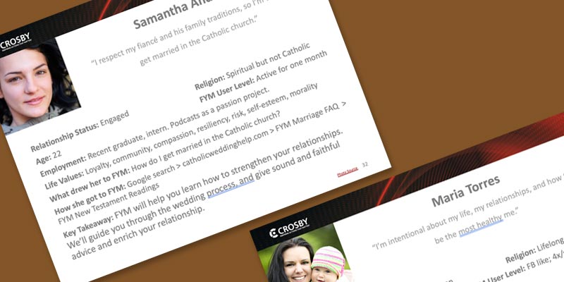
The analytics and survey combined helped me understand the full story of different site visitors. This informed the competitive review where I highlighted what makes For Your Marriage unique and opportunities to differentiate from the competition. I also created personas to illustrate these findings and guide our work:
THE IDEAS
Dynamic and Responsive Display
In order to allow users to quickly find content, I focused on tagging content appropriately so it could dynamically display on inter-related topics. I worked closely together with our digital strategist and developer to ensure the technical build would meet users needs. Designing mobile-first visual modules to displayed related content was critical to help site visitors find what they were looking for and more.
Balancing the Audience and Client Needs
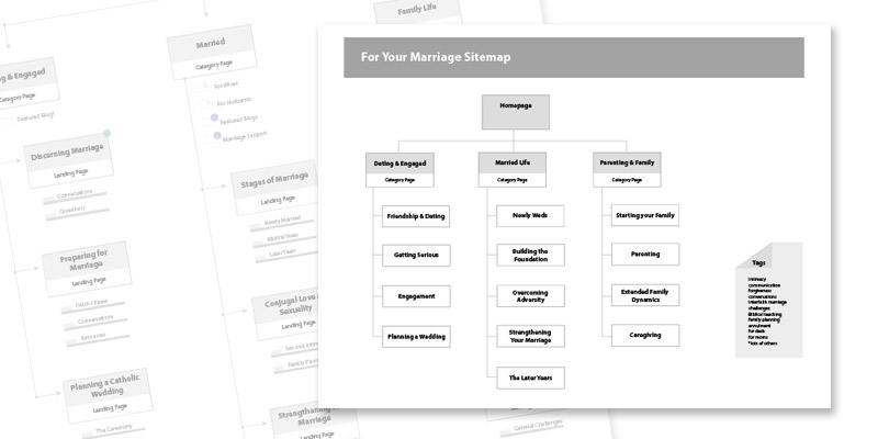
Some of the taxonomy concepts were complex due to our innovative use of tagging and displaying content dynamically, but we understood the importance of customer input and review. I worked hard to help them understand why dynamic display would help revolutionize the site. These iterations of sitemaps helped explain tagging:
The daily marriage tip is an important touch point for site visitors, so we came up with a number of creative solutions to make sure that content was eye-catching and inspiring. Some early ideas:

Refreshing the Brand
For the brand, I focused on the client’s primary demographic of women in their 20s and 30s who were planning to get married soon or raising a family. I conceptualized multiple directions in style tiles to ensure our site designs would align with client expectations. Here are two stylistic options I presented. The option on the right was selected:
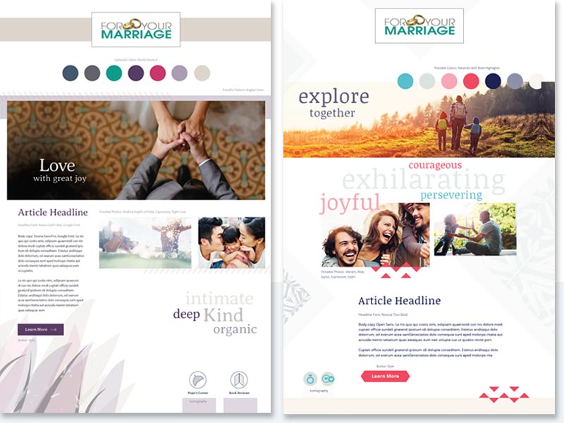
Agreeing on visual expectations up front allowed me to iterate on site designs with ease.
I also updated the site’s color palette, refreshed the logo, and identified 100 high quality relevant stock photos to represent the brand.
THE CONCLUSION
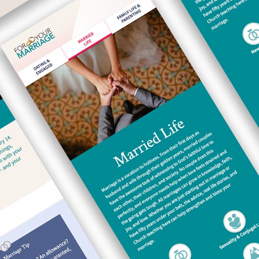
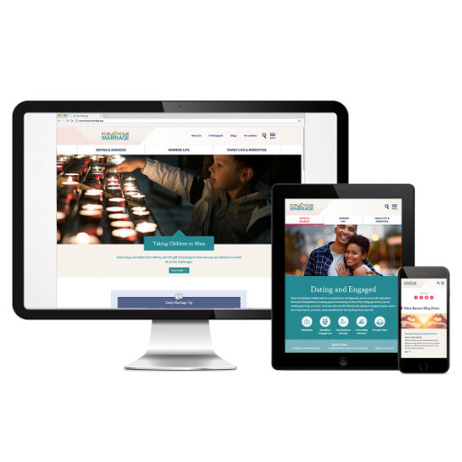
We reimagined and revitalized FYM to vastly improve usability and visual appeal. The site is now responsive and easy for the client to update themselves. They were very pleased with the results.
URL: foryourmarriage.org
